
Project Summary
As part of our UX/UI/FE Dev boot camp, our team was tasked with choosing a passion project to develop from the ground up: starting with UX design to empathize with users’ needs then moving to UI design to develop a data-backed solution and ending with a coded prototype to showcase the full gamut of skills we acquired during the intensive 6 month program.
We were all given the opportunity to pitch an idea and teams were formed within the cohort based on which ideas were voted for. I pitched an idea I began formulating in graphic design school where I developed a brand called Teasers for a packaging design project. The intent with the branding and packaging design was to provide a unique take on serving quality loose leaf tea. I wanted to reboot the concept through the lens of user experience design. The idea was well-received and our team was formed with a shared passion for tea.
The resulting Teasers app is a product of our user research where we discovered important challenges that are being faced by aspiring tea enthusiasts. After going through the user research and definition phases, developing prototypes and testing them, followed by coding a final prototype, we presented our findings and design process with our boot camp cohort.
Project Duration
3 weeks| March 2023
Team
UX/UI Designers| Ross Enger, Matt Thorstad, Ingrid Andersen, & Danica Samuel
My Role
User research, definition, ideation, visual design, prototyping, interaction, usability testing, front-end development
Tools
Figma, Visual Studio Code, GitHub, Miro, Adobe CC, Google suite
The Problem
Aspiring tea enthusiasts feel intimidated by the abundant information about tea and struggle with knowing where to start with their tea journey.
The Solution
A mobile app that empowers anyone taking their first step in entering the world of tea with an inviting experience that onboards them through a simple tea 101 crash course that can be easily completed in the time it takes to brew a cup of tea.
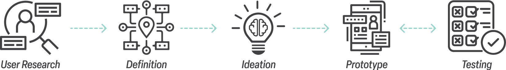
Design Process

User Research
After rallying a team around the Teasers concept to build upon, we started discussing what we wanted to learn more about regarding tea and more importantly tea drinkers. We exchanged anecdotes about our own experiences of tea as well as what we’ve heard from our friends and family. While we could all agree that there is much to appreciate about tea, we wanted to find opportunities to address challenges that people may be facing with their experience with tea. A theme that emerged from this conversation is that there is so much to learn about tea that it can be overwhelming to manage, but we wanted to test users to see what their experiences are.
Through this conversation, we agreed that the best place to start would be to collect qualitative data through user interviews. We wanted to learn not only from existing tea enthusiasts, but folks aspiring to incorporate tea into their lives as well. For new users, we wanted to understand what drew them to drinking tea and what stopped them from going further. Whereas for our experienced users, they’re past the beginning stages and already have their own tea routines. So, we wanted to know what struggles they had with processes surrounding tea (remembering experiences, brewing, buying, etc.).
Our team had a mixture of experienced and inexperienced tea drinkers to interview, so we created an interview plan for both groups. In total, we conducted 6 interviews.

User Interviews
Objective:
- Speak with aspiring and existing tea enthusiasts to identify challenges they face in their experience with tea
Method:
- 2 interview scripts
- 6 interviews with both inexperienced and experienced tea drinkers
User Interview Plan - New Users
- Have you ever tried any teas before? If so, what was your experience like? If not, what has stopped you?
- What aspects of tea are you curious about?
- What challenges have you experienced revolving around tea?
- When it comes to buying tea, what factors would be the most important to you?
- If you were to use a tea app, what features would be most important to you as a beginner?
User Interview Plan - Experienced Users
- What inspired you to become a tea lover, and what role does tea play in your life?
- What challenges have you experienced revolving around tea?
- What do you feel would be helpful to learn more about tea brewing methods/instructions?
- How do you keep track of which teas you have tried and whether you liked them or not?
- How do you typically share your tea experiences with others?
- When it comes to buying tea, what factors are most important to you?
Affinity Diagram
After conducting our user interviews, we synthesized our findings into an affinity diagram to help find patterns in our data. Having grouped our interview results into 7 categories, it was then easier to distill some key takeaways.
As our team discussed in our initial conversation about tea prior to our user interviews, our users expressed that all of the information available about tea (background info, brewing methods, flavor profiles, etc.) makes it intimidating for anyone just starting out leaving them struggling to know where to start.
Additionally, both groups we interviewed expressed how picking teas can be a daunting task given the vast amount of teas to choose from. Lastly, we heard from our experienced tea enthusiasts that it can be a struggle to manage all of the teas they’ve tried as well as the teas they want to try in the future.

User Interview Results
- Knowing Where To Start
- Choice Anxiety
- Keeping Track of Teas
“I don’t how how to gather information about tea.”
“I want to get into tea, but there are so many options, it’s hard to choose one.”
“I experienced a chai that was really good, but I can’t remember where to find it.”

Definition
While our user research yielded a variety of noteworthy takeaways, for the scope of this sprint, we focused on 1 primary insight to start with as we moved into the definition phase. We agreed that there was the most value in addressing a problem for newcomers to tea as we suspected they were the least represented by existing solutions relating to tea. Also, by starting with helping them, they will then stand to benefit in the future from other solutions for experienced tea drinkers.
The primary insight we chose to reference as we moved forward in the design process was that aspiring tea connoisseurs struggle entering the world of tea because they don’t know where to begin and need information laid out simply for them.
With this insight in mind, we developed formulated the main problem to address as we moved forward: aspiring tea enthusiasts feel intimidated by the abundant information about tea and struggle knowing where to start with their tea journey.
User Insight
Aspiring tea connoisseurs struggle entering the world of tea because they don't know where to begin and need information about tea laid out simply for them.
Problem Statement
Aspiring tea enthusiasts feel intimidated by the abundant information about tea and struggle with knowing where to start with their tea journey.
User Persona
With our primary user insight and problem statement define, we used all of the data we gathered through our user research to define a persona to reference once we began brainstorming and prototyping.
Our persona, Tim, represents our users who are new to drinking tea and feel intimidated when attempting to incorporate it into their lives. Tim is someone who finds himself in the middle of some big life changes, and one of the things he’s interested in changing is his lifestyle when it comes to what he puts in his body. He knows that tea is a lot healthier than coffee and energy drinks (which he’s used to drinking) but he needs a little help figuring out how to get started with that.
We outlined some of Tim’s more specific goals, needs and challenges, such as his need for structure and routine when beginning something new, and also the challenge he faces when it comes to not shutting down when it comes to new things he doesn’t understand yet.


Ideation
Competitor Analysis
Knowing the type of user we were going to by designing a solution for, we then moved on to the ideation phase where we began with analyzing competitors to get a better idea of what solutions already existed and identify untapped opportunities for our users.
We chose 2 direct competitors and 2 indirect competitors to analyze. For our direct competitors, we found that neither appeared to be accessible to new tea drinkers, however they did have some features we felt would be helpful experienced users such as steep timers, tea tracking capability, and a tea community component.
As for the indirect competitors, we liked that Art of Tea included a Tea Academy, though it was not included in an onboarding flow and Untappd featured an ability to track habits which we found valuable.
Sencha - Direct Competitor
- Steeping timer makes tea process engaging
- Tea tracking options
- Subscription plans are geared towards experienced tea users

My Tea Pal - Direct Competitor
- Good for folks looking for a tea community
- Likely difficult for beginners to use
- Somewhat confusing for new users

Art of Tea - Indirect Competitor
- Tea Academy education program
- Steep times quick reference page
- Confusing navigation

Untappd - Indirect Competitor
- Profile lets you create lists and track habits
- Rating feature and seeing friends’ activities creates community
- Many features stuck behind a paywall

Brainstorming
As we began to shift our focus from empathizing with users and the definition phase to the solution phase, we took all of the information we had gathered and went through some brainstorming exercises. The product of these exercises was one key feature to focus on immediately and an additional feature to develop in the future with more time and resources.
For the immediate-term, we settled on making our users a tea apprentice through an educational course within 5 minutes. Then, in the future we could incorporate the ability for users to receive featured tea recommendations every day based on their preferences.

Journey Map
Next, we created a journey map for Tim highlight the key touchpoints he would experience as he transitioned from being a complete beginner to drinking tea to becoming an apprentice and even being armed with the knowledge to try and track new teas.

User Flow
Knowing that our research data uncovered that users can feel overwhelmed with everything there is to know about tea, we set out to create an intuitive user flow aimed at simplifying the overwhelming scope of tea knowledge. When users launch the Teasers app, they begin the onboarding process and are given the option to take the informative and delightful Tea 101 Crash Course.
We selected the most important, high-level aspects of tea to showcase to our users including: background information, production methods, herbal teas, brewing methods, health benefits, caffeine content, culture, and loose leaf vs tea bags. While this information will not make our users experts on tea, our intent was to empower them to kickstart their tea journey. By completing the brief yet informative crash course in about the time it takes to brew a cup of tea, they will become a tea apprentice and are ready to take advantage of the rest of what the app has to offer, as previewed in the remaining pages of the onboarding flow.


Prototype
Low-Fidelity Prototype
With our user flow define, we began our low fidelity prototype where we set out to display the tea content in digestible sections. To reinforce each section, we made sure to include images and even added carousels where necessary. We wanted users to feel guided and have a sense of where they were at in the course, so we added a progress indicator. Lastly, we wanted users to have an idea what to expect with the Teasers app, so to complete the onboarding process, they are guided through each tab with an explanation of what they do.
Flow 1 - Taking Tea 101 Crash Course

Flow 2 - Skipping Tea 101 Crash Course


Testing
Usability Testing
After completing this prototype, we conducted usability testing to validate our solution and uncover any pain points that may be existing. We tested 4 users, asking them to put themselves in the shoes of users like Tim by imagining that they are new to tea and looking to learn more. Tasked them to navigate through the onboarding process without instruction, vocalizing any impressions as they go. We observed their actions as they worked their way through the app and asked for additional feedback once they were finished.
Usability Testing Plan
- 4 users: friends we know who agreed to test out the app
- User scenario: imagine you’re new to tea and you’re looking to use the TEASERS app to learn more
- Task users to make their way through the app without instruction
- When they finish, ask users the following questions:
- How did you find the overall experience?
- Was anything confusing?
- What would you suggest?
Usability Testing Results
What we discovered was largely positive. All users were left with a good impression of the app indicating that there was value in it being an informative onramp for newcomers to tea. Some key insights include: one user reported that while it was good information, it was a bit overwhelming and might be difficult to retain all of the information while another user reported similarly that it would be helpful to be able to come back to this information later in the app.
- “Very fun, informative, and easy to use! I wish it was a real app so I could use it!”
- “Loved the icons on the tabs, the style, and the overall design!”
- “Tea 101 was good but a little overwhelming because of so much information. It was hard for me to remember all of it at the end.”
- “It would be great if Tea 101 was available after the walkthrough in another tab. I didn’t like how I couldn’t go back to it.”
Prototype
Style Guide
While we realized there were some opportunities for improvement, we were pleased to validate that users like Tim were finding value in the educational aspect of the onboarding process. That said, it was equally important for us to design the Tea 101 content with approachability in mind.
As we moved on to styling the app, our focus was to provide a visually inviting experience while maintaining an organic feel inspired by tea imagery. To achieve this, we used a clean typeface with rounded features, a simple color scheme that samples colors from various teas, and delightful images intended to provide an alluring window into tea culture.

High Fidelity Prototype
Here, you can see our iterated prototype with styling incorporated from our guide. For users that choose to take the Tea 101 course, we wanted to add some extra personality to the progress indicator by adding a visual that mimics a cup of tea being brewed until it's perfectly steeped by the time users complete the course.
We used carousels to highlight the visual diversity of tea and to display various tea types easily. Several of the users we interviewed spoke to their curiosity about caffeine with tea vs. coffee, so we created a graphic to break down the caffeine content and caffeine crash levels of various teas compared to coffee. As was revealed with usability testing, some users preferred to come back to the Tea 101 course, so we added a message indicating not to worry if the course is skipped as it can always be accessed later in the app.
We then put the prototype through an additional round of usability testing, however users reported no additional glaring issues. We were glad to find that users were delighted the updated use of styling.

Coded Prototype
We then moved on to coding our prototype using HTML, CSS, JavaScript, and Bootstrap. Since users gave a positive review of the visual style, our goal for coding the app was to stay as true as possible to the high fidelity prototype.

Future Opportunities
- Engage users with gamified Tea 101 Crash Course Quiz
- Perform additional user testing to identify ideal business model for purchasing options (i.e. subscription vs. on demand orders)
- Custom curated TEASERS for sampling new loose leaf teas
- Bulk size loose leaf purchases
- Develop functionality of app beyond onboarding process with experienced tea drinker persona in mind
In the future, we have the opportunity to expand the app in a number of ways. In our usability testing, it was revealed that some people may struggle to retain all of the information about tea. To address this, there is an opportunity to engage users and incorporate a gamified approach with a Tea 101 Crash Course Quiz to help solidify users’ tea knowledge. Additionally, it would be valuable to perform additional user testing to identify the ideal business model for Teasers purchasing options (ie. weighing a weekly or monthly subscription vs. on demand orders).
The opportunity I’m most excited about, however, is developing the app’s core functionality as was previewed at the end of the onboarding process. For the scope of this prototype, we focused on helping users like Tim feel comfortable getting started with tea, but we also gleaned important insights from experienced tea drinkers.
So, we developed an additional persona, Mandy, who is already an established tea connoisseur but can be disorganized, unlike Tim who is an organized business owner. She often feels overwhelmed when keeping track of the teas she’s tried and suffers from choice anxiety due to the myriad of tea options available.

Lastly, by developing the remaining sections of the Teasers app, we can help prevent folks like Mandy from feeling overwhelmed by allowing them to easily track their tea experiences and get featured tea recommendations based on this data. They can even create custom steep timers for their favorite teas. And not to forget to provide the ability to easily create their own custom Teasers packs to sample new delicious loose leaf teas, from the convenience of the Teasers app.
