Project Summary
As part of my UX/UI design boot camp, I was tasked with redesigning a government agency website and creating a responsive user interface. I was given 5 weeks to complete this design challenge.
I selected the Bureau of Land Management as I enjoy camping and have utilized resources managed by BLM before and I saw an opportunity to improve the UX/UI of the website. I focused on the user flow for anyone interested in visiting the site to learn more about camping on BLM land. Deliverables for this case study include: proto-persona, usability testing results, heuristic evaluation, feature prioritization matrix, mood board, card sorting, site map, low-fidelity prototypes, style guide, high-fidelity prototypes, and usability testing.
Project Duration
5 weeks| Nov. 2022 - Dec. 2022
My Role
UX/UI Designer| User research, definition, ideation, information architecture, visual design, prototyping, interaction, & testing
Tools
Figma, Miro, InVision, Adobe CC, & Google Suite
The Problem
The current website lacks visual consistency and makes it difficult for users to achieve simple tasks such as finding information about camping on BLM land.
The Solution
Redesign and test the website with an emphasis on improved information architecture and visual consistency to enable users to utilize the website’s resources more easily.
Design Process


User Research
Proto-Persona
To begin the project, I created a proto-persona to represent my best guess of who is using the BLM website and begin thinking about potential pain points experienced by users. Specifically, for this project I focused on the user flow for people interested in learning more about camping on BLM land. Below, you can see Thomas who represents a user who is looking to plan his next adventure but is concerned about certain details regarding camping on BLM land such as campsite location and public land rules.

Usability Testing
I tested 5 users that fit a similar description as my proto-persona and asked them to navigate through the current website and find details regarding camping in the South Maricopa Mountains Wilderness Area. 80% of users did not have an issue finding general camping information in Arizona, however all users struggled to find the South Maricopa Mountains Wilderness Area page. All users expressed that they expected to find a link to the South Maricopa Wilderness Area from the Arizona Recreation page. Additionally, some users struggled sorting through the 62 alphabetical search results when searching for camping areas in Arizona.
Having gathered qualitative data from users on the current condition of the website, it was clear to me that there was an opportunity to make the process easier to find camping information on BLM land.


Definition
Heuristic Evaluation
In addition to testing users on their experience when using the website, I also performed a heuristic evaluation. A number of issues stood out to me that not only make the website less aesthetically pleasing, but also make it more difficult for users to accomplish simple tasks such as finding camping information. For example, inconsistency of alignment of elements on the page as well as use of color make it difficult scan the content. Further, the use of so many navigation menus makes is confusing for users to know where to start to find the info they are looking for.


Color Accessibility
In addition to heuristics, I tested various color combinations on the site and found that 5 pairs do not pass a color accessibility test due to contrast ratio. This implied to me that a new color scheme should be implemented that will be accessible for all users.
Feature Prioritization
With insights gained from user testing and a heuristic evaluation, I used a feature prioritization matrix to define key features to focus on during the website redesign. I found that clearing up confusion over finding specific camping information is the highest priority for users as well as for the BLM website.


Ideation
Mood Board
With the objective in mind of making it simpler for users to obtain specific camping information, I created a mood board documenting inspiration for UI patterns, color schemes, imagery, and visual composition.

Card Sorting - Grouping
One of the key insights I took from user testing of the current site as well as the heuristic evaluation was a lack of effective information architecture. To help improve this aspect of the site, I performed a card sorting exercise, starting with grouping all links on the website into 7 main categories.

Card Sorting - Structure
Next, I sorted through the 7 main categories and identified ways to structure them more simply. Below you can see the result where there are 4 primary categories, with additional divisions. With the original site, there were often numerous ways to arrive at the same destination, making it overwhelming for users to know where to start when finding even simple information. Reducing the number of primary navigation menu items makes it clearer for users to know where to start.

Sitemap
The structure from the card sorting exercise was then translated into a new site map for the website redesign. The focus here was to reduce the number of navigation menus as I discovered through the user research that the number of navigation menus on the current site made it confusing for users to know where to start.


Prototype
Low-Fidelity Wireframes
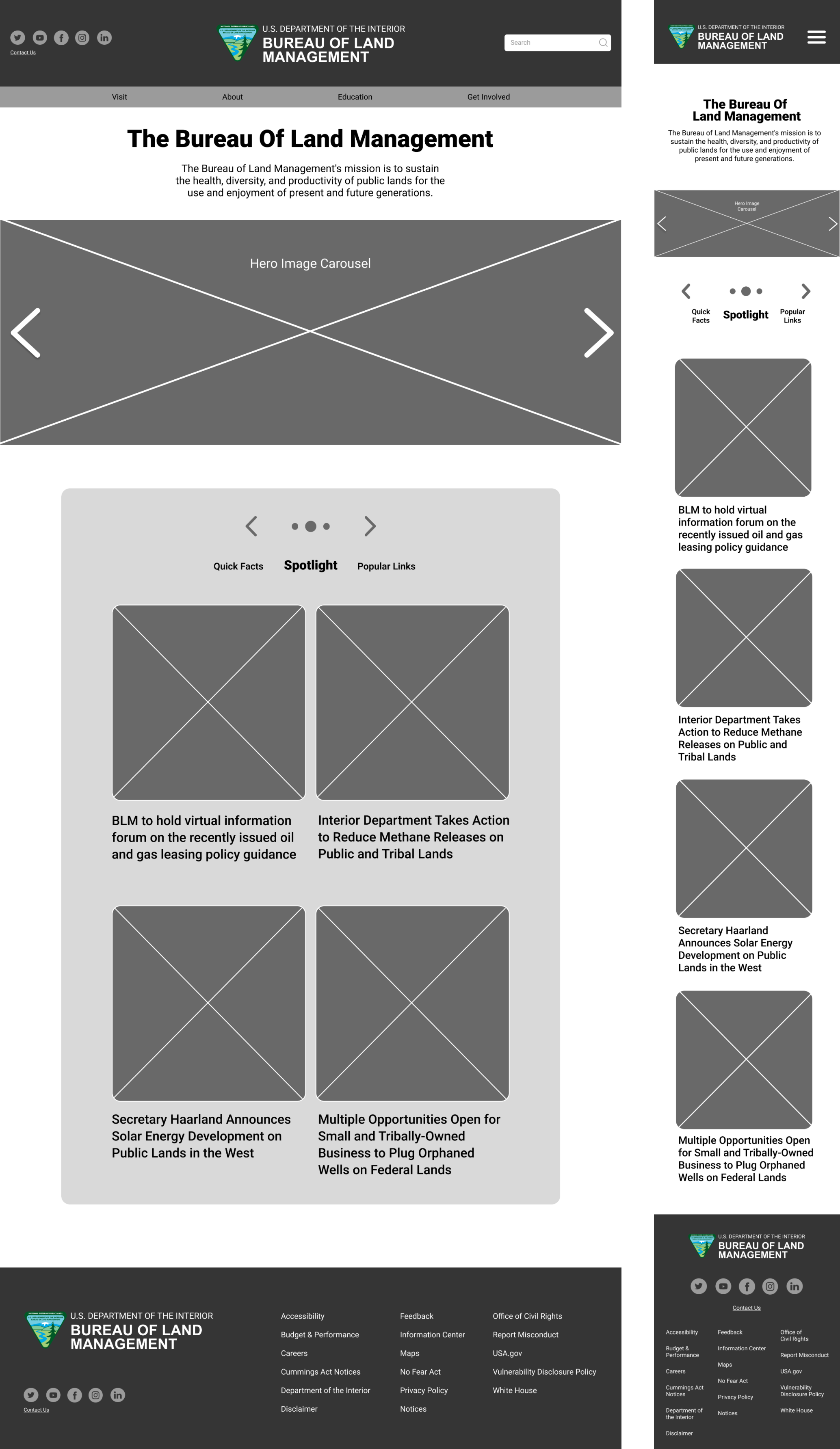
Based on the qualitative data gathered in my user research as well as my analysis of the current UI, I began designing the homepage on desktop and mobile. I wanted the overall look and feel of the site to be much simpler and highlight key BLM imagery. I implemented a hero carousel as it serves as a simple and clean way to give users a glimpse of some of the land managed by the agency. As covered in the sitemap, I implemented a simpler primary navigation menu and organized the secondary links section to make it simpler and more visually appealing to sor through this content.

Style Guide
With the structure of the homepage designed, I moved on to styling the site. I wanted website to be represented by elements on the page that convey information in a direct and legible way. This entails using hierarchy to display colors, type, and images so that the most important information is observed first. The typeface used is intended to add character to the website and help distinguish it from other governmental websites while maintaining legibility. The imagery used is intended to entice and excite users about utilizing the public lands managed by BLM that are available to them.

Responsive Break Points
Since users access the website through various devices, I wanted to make sure the site is responsive and accessible on desktop, tablet, and mobile. Below you can see the responsive break points for these devices.

Before Redesign
Below, you can see the original site on desktop and mobile and all of the aspects covered in the heuristic evaluation.
.gif)

After Redesign - High-Fidelity Prototypes
Below, you can see my redesign of the website. Consistent use of styling defined in the above guide was used to improve the aesthetic quality of the website and promote engagement. Hero carousels and simple icons to represent various categories of content were used to help captivate users. The hope was to transform the government agency website - something that many may typically perceive as administrative and impersonal - into a tool that users enjoy using to utilize BLM resources.


Testing
I then tasked the same 5 users that tested the original site with finding camping information on the high-fidelity prototypes. Overall, all users were able to navigate to the camping information faster than on the original site for both desktop and mobile. On desktop, all users found this info by navigating through the “Visit” tab in the primary menu. For one user, it was not obvious that the homepage is scrollable, so including content “above the fold” could help prevent this. In addition to improved access to camping information, all users described the redesign as more aesthetically pleasing and visually consistent.
Conclusion
Looking back on the process of redesigning this website, first and foremost I was pleased to discover that users reported an improved experience in finding camping information as well as reporting a more cohesive UI. Seeing as the original site has a substantial amount of content and numerous pages, I found this project rewarding by rethinking and streamlining the information architecture for a specific user path. Given the nature of the website, I did not find it appropriate to focus on decorative elements or interactions. That said, I enjoyed creating a unified visual style that relies on balance achieved with hierarchy and alignment.
Future Opportunities
If given the opportunity to develop the website further, I would start by applying the same visual style to remaining pages. There are numerous other user paths beyond accessing camping information, so I would also like to go through the same process of simplifying the information architecture for all other user paths. Additionally, I believe that incorporating a user-friendly map feature would enhance user’s experience in planning trips on BLM land.


